Text Overview for Beginners
Introduction
Apple says: "A view that displays one or more lines of read-only text."
That definition is clear enough to understand, but I will also add that Text is arguably the most used swiftUI View of all.
Getting started
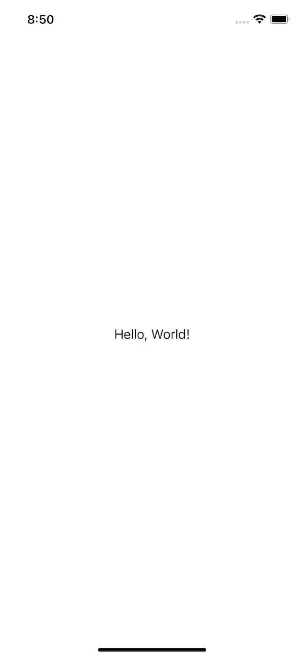
To get started, just create a simple project.
// $$liquidcoderID-TextOverview1
// $$liquidcoderFilename-ContentView

import SwiftUI

struct ContentView: View {

    var body: some View {

        // highlight-start
        Text("Hello, world!")
        // highlight-end

    }
}

struct ContentView_Previews: PreviewProvider {
    static var previews: some View {
        ContentView()
    }
}
Once created, you get the simplest Text view that you can have with no modifier.
Applying Fonts
To change font of a given Text , apple gives us the font(_:) modifier.
Apple says about
font(_:): "Sets the default font for text in this view."
func font(_ font: Font?) -> some View
As you have just seen, the font(_:) modifier takes in a Font type, and returns a View.
extension Font {

    /// A font with the large title text style.
    public static let largeTitle: Font

    /// A font with the title text style.
    public static let title: Font

    /// Create a font for second level hierarchical headings.
    @available(iOS 14.0, macOS 11.0, tvOS 14.0, watchOS 7.0, *)
    public static let title2: Font

    /// Create a font for third level hierarchical headings.
    @available(iOS 14.0, macOS 11.0, tvOS 14.0, watchOS 7.0, *)
    public static let title3: Font

    /// A font with the headline text style.
    public static let headline: Font

    /// A font with the subheadline text style.
    public static let subheadline: Font

    /// A font with the body text style.
    public static let body: Font

    /// A font with the callout text style.
    public static let callout: Font

    /// A font with the footnote text style.
    public static let footnote: Font

    /// A font with the caption text style.
    public static let caption: Font

    /// Create a font with the alternate caption text style.
    @available(iOS 14.0, macOS 11.0, tvOS 14.0, watchOS 7.0, *)
    public static let caption2: Font

    /// Gets a system font with the given style and design.
    public static func system(_ style: Font.TextStyle, design: Font.Design = .default) -> Font

        /// Adds italics to the font.
    public func italic() -> Font

    /// Adjusts the font to enable all small capitals.
    public func smallCaps() -> Font

    /// Adjusts the font to enable lowercase small capitals.
    public func lowercaseSmallCaps() -> Font

    /// Adjusts the font to enable uppercase small capitals.
    public func uppercaseSmallCaps() -> Font

    /// Adjusts the font to use monospace digits.
    public func monospacedDigit() -> Font

    /// Sets the weight of the font.
    public func weight(_ weight: Font.Weight) -> Font

    /// Adds bold styling to the font.
    public func bold() -> Font

        public static func custom(_ name: String, size: CGFloat) -> Font

    /// Create a custom font with the given `name` and `size` that scales
    /// relative to the given `textStyle`.
    @available(iOS 14.0, macOS 11.0, tvOS 14.0, watchOS 7.0, *)
    public static func custom(_ name: String, size: CGFloat, relativeTo textStyle: Font.TextStyle) -> Font

    /// Create a custom font with the given `name` and a fixed `size` that does
    /// not scale with Dynamic Type.
    @available(iOS 14.0, macOS 11.0, tvOS 14.0, watchOS 7.0, *)
    public static func custom(_ name: String, fixedSize: CGFloat) -> Font
}
The Font has some pre-defined values, but you can also create a new instance using the system method if you want to use the system font or using the custom method to create a new font from a custom font.
Now let's go over some modifiers that one can apply to a Text view.
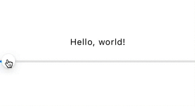
Kerning
Apple says:"Sets the spacing, or kerning, between characters"
// $$liquidcoderFilename-ContentView

import SwiftUI

struct ContentView: View {

    // highlight-start
    @State private var value: Double = 0
    // highlight-end

    var body: some View {

        // highlight-start
        VStack {
            Text("Hello, world!")
                .kerning(CGFloat(value))

            Slider(value: $value, in: 0...100, step: 0.1)
        }
        // highlight-end

    }
}
BaselineOffset
Apple says: "Sets the vertical offset for the text relative to its baseline."
import SwiftUI

struct ContentView: View {

    @State private var value: Double = 0

    var body: some View {

        VStack {
            Text("Hello, world!")
                // highlight-start
                .baselineOffset(CGFloat(value))
                // highlight-end
                .background(Color.blue)

            Slider(value: $value, in: 0...100, step: 0.1)
        }
    }
}

struct ContentView_Previews: PreviewProvider {
    static var previews: some View {
        ContentView()
    }
}

TextCase
Apple says: "Sets a transform for the case of the text contained in this view when displayed."
// $$liquidcoderID-TextOverviewTextCase
// $$liquidcoderFilename-ContentView

import SwiftUI

struct ContentView: View {

    // highlight-start
    @State private var flag: Bool = false
    // highlight-end

    var body: some View {

        VStack {
            Text("Hello, world!")
                // highlight-start
                .textCase( flag ? .uppercase : .lowercase)
                // highlight-end

            // highlight-start
            Toggle(isOn: $flag, label: {
                Text("Change case")
            })
            // highlight-end
        }
    }
}
MinimumScaleFactor
Apple says: "Sets the minimum amount that text in this view scales down to fit in the available space."
import SwiftUI

struct ContentView: View {

    @State private var value: Double = 0

    var body: some View {

        VStack {
            Text("A very loooooooooong text")
                // highlight-start
                .minimumScaleFactor(CGFloat(value))
                // highlight-end
                .frame(width: 50, height: 30)
                .background(Color.yellow)

            Text("Scale: \(value)")

            Slider(value: $value, in: 0...1, step: 0.1)
        }
    }
}

LineNumber
Apple says:"Sets the maximum number of lines that text can occupy in this view."
import SwiftUI

struct ContentView: View {

    @State private var value: Double = 0

    var body: some View {

        VStack {
            Text("Lorem ipsum dolor sit amet, consectetur adipiscing elit, sed do eiusmod tempor incididunt ut labore et dolore magna aliqua. Ut enim ad minim veniam, ")
                // highlight-start
                .lineLimit(Int(value))
                // highlight-end
                .frame(width: 100)
                .background(Color.yellow)

            Text("Line number: \(Int(value))")

            Slider(value: $value, in: 0...10, step: 0.1)
        }
    }
}

LineSpacing
Apple says: "Sets the amount of space between lines of text in this view."
import SwiftUI

struct ContentView: View {

    @State private var value: Double = 0

    var body: some View {

        VStack {
            Text("Lorem ipsum dolor sit amet, consectetur adipiscing elit, sed do")
                // highlight-start
                .lineSpacing(CGFloat(value))
                // highlight-end
                .frame(width: 100)
                .background(Color.yellow)

            Text("Line number: \(Int(value))")

            Slider(value: $value, in: 0...10, step: 0.1)
        }
    }
}
MultilineTextAlignment
Apple says:"Sets the alignment of multiline text in this view."
This modifier takes in a parameter of type TextAlignment and returns a View.
import SwiftUI

struct ContentView: View {

    @State private var value: Double = 0

    // highlight-start
    @State private var alignment: TextAlignment = .leading
    // highlight-end

    var body: some View {

        VStack {
            Text("Lorem ipsum dolor sit amet, consectetur adipiscing elit, sed do")
                // highlight-start
                .multilineTextAlignment(alignment)
                // highlight-end
                .background(Color.yellow)

            HStack(spacing: 30) {
                Button (action: {
                    alignment = .leading
                }, label: {
                    Image(systemName: "text.alignleft")
                        .resizable()
                        .frame(width: 30, height: 30, alignment: .center)
                })

                Button (action: {
                    alignment = .center
                }, label: {
                    Image(systemName: "text.aligncenter")
                        .resizable()
                        .frame(width: 30, height: 30, alignment: .center)
                })

                Button (action: {
                    alignment = .trailing
                }, label: {
                    Image(systemName: "text.alignright")
                        .resizable()
                        .frame(width: 30, height: 30, alignment: .center)
                })
            }.padding()
        }
    }
}

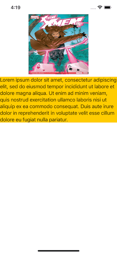
FixedSize
Take a look at the image, and see how the text is cut out. Well we can fix this using the fixedSize modifier.

Apple says about
fixedSize: "Fixes this view at its ideal size in the specified dimensions."
import SwiftUI

struct ContentView: View {

    var body: some View {

        ScrollView {
            VStack {
                Image("image")
                    .resizable()
                    .frame(width: 200, height: 200, alignment: .center)
                    .scaledToFit()
                Text("Lorem ipsum dolor sit amet, consectetur adipiscing elit, sed do eiusmod tempor incididunt ut labore et dolore magna aliqua. Ut enim ad minim veniam, quis nostrud exercitation ullamco laboris nisi ut aliquip ex ea commodo consequat. Duis aute irure dolor in reprehenderit in voluptate velit esse cillum dolore eu fugiat nulla pariatur. ")
                    // highlight-start
                    .fixedSize(horizontal: false, vertical: true)
                    // highlight-end
                    .background(Color.yellow)
            }
        }
    }
}
Apple also says: "
fixedSize(horizontal:vertical:)the fixing of the axes can be optionally specified in one or both dimensions. For example, if you horizontally fix a text view before wrapping it in the frame view, you're telling the text view to maintain its ideal width. The view calculates this to be the space needed to represent the entire string."
To fix the issue where the text does not appear in full, just add the fixedSize modifier setting only the vertical dimension to true to fix the Text 's height.
The Text struct has multiple overloads for the init method which allow you to pass a bunch of extra parameter to format the content.
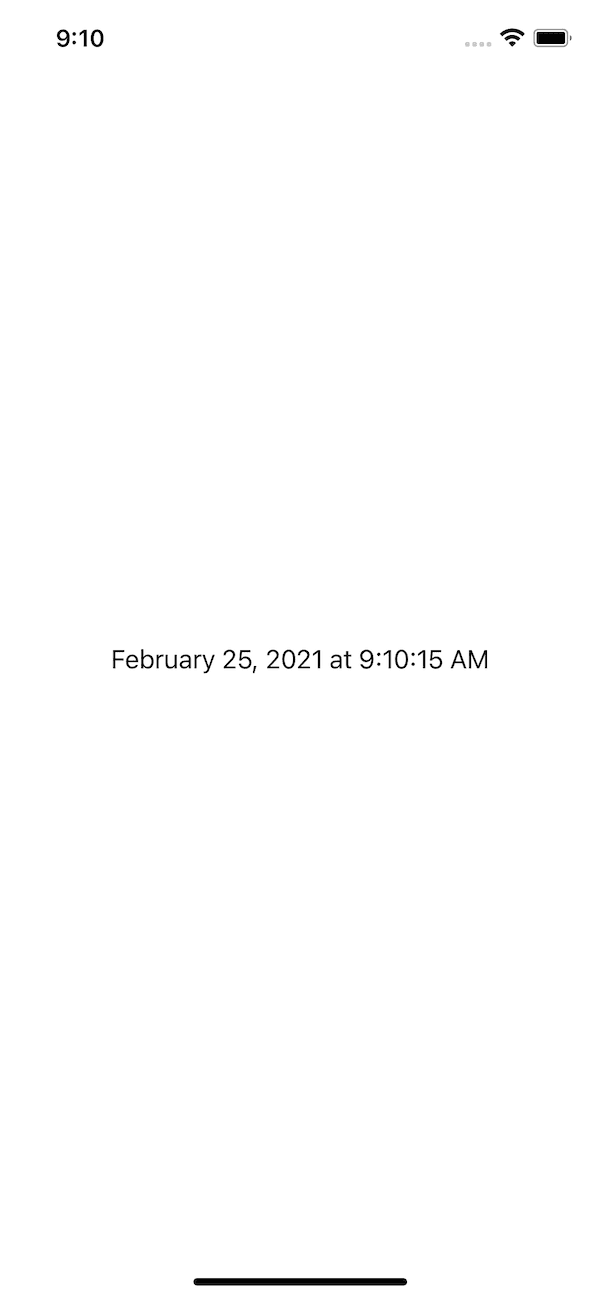
Text with Formatter
As you can see, the initialiser takes in a subject to be formatted and a formatter to use.
public init<Subject>(_ subject: Subject, formatter: Formatter) where Subject : NSObject
public init<Subject>(_ subject: Subject, formatter: Formatter) where Subject : ReferenceConvertible
Here is a list of pre-built formatters that one can use
ByteCountFormatter, DateFormatter, DateComponentsFormatter, DateIntervalFormatter, EnergyFormatter, LengthFormatter, MassFormatter, NumberFormatter, and PersonNameComponentsFormatter.
Let's take the DateFormatter as an example, and use it.
// $$liquidcoderID-TextOverviewAltInit3
// $$liquidcoderFilename-ContentView

import SwiftUI

struct ContentView: View {

    // highlight-start
    private var dateFormatter: DateFormatter {
        let formatter = DateFormatter()
        formatter.dateStyle = .long
        formatter.timeStyle = .medium
        return formatter
    }
    // highlight-end

    var body: some View {

        // highlight-start
        VStack {
            Text(Date(), formatter: dateFormatter)
        }
        // highlight-end
    }
}
We first create the formatter, then create the Text using it. This will style the Text content according to the style you set in formatter.
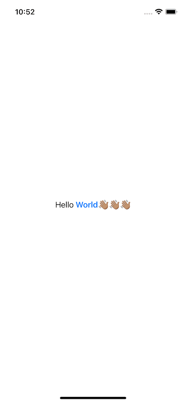
Text Concatenation
You can also concatenate 2 or more instances of a Text using a "+" sign or the traditional swift way, and give each fragment a different style.
import SwiftUI

struct ContentView: View {

    @State private var animate: Bool = false

    var body: some View {

        // highlight-start
        Text("Hello")
            + Text(" World \(Text("👋🏽👋🏽👋🏽"))")
            .bold()
            .foregroundColor(.blue)
        // highlight-end
    }
}
Sliding Text Effect
// $$liquidcoderID-TextOverviewFinalDemo
// $$liquidcoderFilename-ContentView

import SwiftUI

struct ContentView: View {

    // highlight-start
    @State private var animate: Bool = false
    // highlight-end

    var body: some View {

        GeometryReader { geometry in
            VStack {
                Text("Lorem ipsum dolor sit amet, consectetur adipiscing elit, sed do eiusmod tempor incididunt ut labore et dolore magna aliqua. ")
                    // highlight-start
                    .fixedSize(horizontal: true, vertical: false)
                    // highlight-end
            }.animation(Animation
                            .linear(duration: 5)
                            .delay(3)
                            .repeatForever()
            )
            .frame(width: geometry.size.width, alignment: animate ? .trailing : .leading)
        }.onAppear {
            animate.toggle()
        }
    }
}
The main recipe to create that sliding is the fixedSize modifier. This time we set the horizontal dimension to true to prevent the text from wrapping .

Text is pretty important in a user interface, it tells stories where pictures and other UI elements display them, and this is just an overview to get you started using it.